So, it’s been a few days since and there still hasn’t been a peep from Ravelry about the feedback or even an apology. I’ve filled in their questionnaire & feedback form re: the change and if you can please consider doing so. This is simply not good enough.
I’m still not interested in spending my bandwidth tearing them down like some are, but I’m really disappointed in Team Ravelry. Here’s hoping for change.
Hi – just a very quick post that I rattle off to you this Tuesday evening.
You will have seen that Ravelry has had a face lift. In broad terms I like it, but as a migraine sufferer there are a lot of aspects that had me – along with many others – asking for a dark mode and contrast issues to be sorted out.
It has transpired that there are quite a lot of accessibility issues that are potentially dangerous, including migraine, aura and seizures. This is not acceptable.
I’m absolutely not jumping on the bandwagon of tearing them down – Ravelry had their own reasons for creating the new interface and launching it as they did and its for them to deal with that feedback and with these issues as they are reported (and there various ways to report the issues) and I suspect that won’t happen as quickly as the new interface went up, but I am confident it will happen.
In terms of the ravelry links on my site, 99.9% of the patterns and designers I have linked to within these posts on Woolwork will take you to ravelry. I do not want anyone to expose themselves to danger, but I also don’t have the time or the personal bandwidth to make changes to all the links on this site. I see others are doing this and if you can that’s great, but I’m not.
SO! here are some things to safeguard you.
1) Don’t click on any links, if you don’t want to.
2) Find out where a link will go without clicking on it.
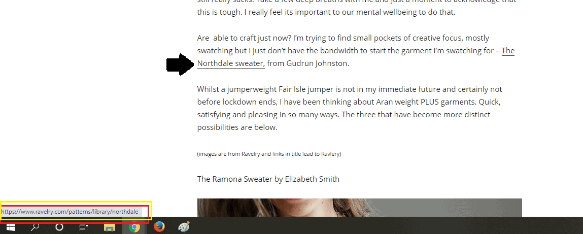
On a computer hover your cursor over the link and in the bottom left corner the destination of that link will display. On some browsers the link address may also pop out next to your cursor when you hover over the link. (Sorry these screenshots are quick and dirty and not very accessible – the irony is not lost on me, folks!)

On an iphone you can do a long press down on a link and it will pop up with a preview of the page that the link will take you to. If I can, I will like to a little screenshot video of that below.
I don’t have an android device, so I’m unsure of the process.
3) You can opt to switch back to the classic view of ravelry until the issues are ironed out. (i’d have the new UI as the opt and keep the classic as default if it were me- but hey! we don’t own ravelry, we use it for free, we don’t have anything to do with the inner workings so all we can do is ask!)
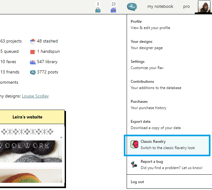
If you are able to log in to the site with the new interface, click on your profile in the top right and classic ravelry. You may have to do this on all your devices where you use ravelry.
Since I have switched back to Classic, as long as I’m signed into ravelry on the same browser, I can click any link in my posts here and the link will open in classic view. I have tried this on FireFox , Chrome and on Safari on my phone
HOWEVER YOUR MILEAGE MAY VARY!
S
I know that many of us are not happy with it in the interim and that it curbs your enjoyment of searching for patterns and using the forums. I know that some of the WoolWork group users will also feel this way.
Again, I hope that the ravelry boffins will manage to address all of the issues that are being reported, including my own.. but I hope if you refer to posts on WoolWork you will take these steps if you are potentially affected by the issues that the new interface might bring.
(If you aren’t happy with doing so, I refer you to point 1)

Thank you, Louise, for these notes, they are very much appreciated, just like the rest of your body of work.
It’s all a bit of a fiasco. Thank you for addressing it calmly and helpfully.
Well said – I have doctorate in visual perception and I am very concerned
I hadn’t been over there so thanks very much for the warning, I really appreciate the advice on how to change it back xx
Thank You Louise for sharing this information.
Love your podcast and all you’ve made me discover.
Wish Ravelry would be much more flexible to it’s users.